Color is one of the most powerful elements in UI/UX design. It influences user perception, evokes emotions, and impacts decision-making. A well-thought-out color scheme enhances usability, improves aesthetics, and strengthens brand identity. Understanding color psychology is key to designing digital experiences that engage users. By leveraging the right color combinations, designers can ensure intuitive navigation and improved user retention.
The Role of Color in UI/UX Design
Colors do more than just decorate a website or an app; they guide users through a digital interface, create a visual hierarchy, and evoke specific emotions. Every color has a psychological impact, and designers must strategically choose color palettes to align with user expectations and brand messaging. A well-balanced color scheme enhances user experience and creates a strong first impression.
How Colors Affect User Perception
- Emotional Response: Colors influence user emotions and interactions with a product. The right hues evoke trust, excitement, or relaxation, depending on the context.
- Brand Recognition: Consistent color usage strengthens brand identity and recall. Users associate specific colors with brands, reinforcing brand awareness and credibility.
- Readability & Accessibility: Proper contrast improves visibility and inclusivity. Accessible color schemes help all users, including those with visual impairments, navigate easily.
- Conversion Rates: Effective color combinations prompt users to take actions like signing up or purchasing. Strategic placement of contrasting colors guides users toward key interactions, improving engagement.
Understanding Color Psychology in UI/UX Design
1. Warm Colors: Energy & Passion
Warm colors create excitement and urgency. They are often used in call-to-action buttons and promotional banners. These colors are also associated with dynamism and high energy, making them effective for engaging users quickly.
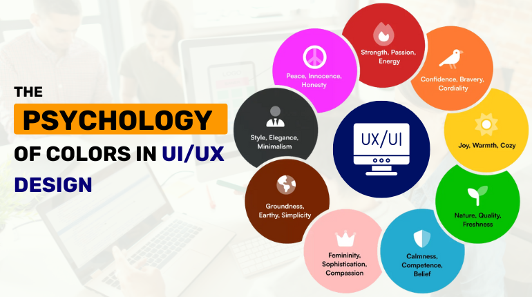
- Red: Represents energy, passion, and urgency. Used for alerts, sales promotions, and warning messages. It also conveys a sense of excitement and immediately captures user attention.
- Orange: Evokes enthusiasm and friendliness. Ideal for buttons and interactive elements. This color signifies motivation and creativity, making it popular for innovative brands.
- Yellow: Symbolizes happiness and optimism. Often used in onboarding screens to create a welcoming feel. Yellow also stimulates mental processes and encourages positivity in users.
2. Cool Colors: Calm & Trustworthy
Cool colors bring a sense of relaxation, trust, and professionalism, making them great for corporate and tech brands. These colors create a soothing and stable user experience.
- Blue: Represents trust, security, and stability. Used by financial institutions and social media platforms. Blue symbolizes intelligence and efficiency, making it a popular choice for tech companies.
- Green: Symbolizes growth, health, and harmony. Frequently seen in eco-friendly and financial applications. It promotes balance and creates a sense of tranquility in user interfaces.
- Purple: Conveys luxury, creativity, and sophistication. Common in beauty, wellness, and premium products. Purple signifies ambition and imagination, making it ideal for artistic and high-end brands.
3. Neutral Colors: Balance & Simplicity
Neutral tones enhance readability and elegance as backgrounds or supporting hues. They provide a timeless aesthetic and complement various design styles.
- Black: Represents power, elegance, and sophistication. Used in luxury and high-end design. Black also creates a sense of mystery and exclusivity, making it suitable for premium brands.
- White: Represents simplicity and clarity, common in minimalistic UI. It creates a clean, organized, and spacious feel.
- Gray: Depicts neutrality and professionalism. Often used in typography and subtle UI elements. Gray adds a modern touch to designs and balances other colors effectively.
Best Practices for Using Colors in UI/UX Design
1. Maintain Visual Hierarchy
Use contrast and color differentiation to highlight key elements, such as buttons, headlines, and navigation menus. Proper color hierarchy ensures users can easily focus on essential content and interactions.
2. Keep Brand Identity Consistent
Stick to a well-defined color palette that aligns with the brand’s personality and message. Consistency in colors across all platforms enhances brand credibility and user trust.
3. Enhance Readability & Accessibility
Ensure sufficient contrast between text and background. This improves legibility, especially for users with visual impairments.
Use color-blind-friendly palettes to accommodate diverse users. Providing alternative cues, such as patterns or labels, enhances accessibility for all.
4. Use Colors to Guide User Actions
Make CTA buttons stand out with high-contrast hues. A visually prominent CTA increases user engagement and conversions.
Use color intensity to distinguish primary and secondary actions, helping users grasp element importance quickly.
Conclusion
Color psychology shapes UI/UX design by influencing user emotions, behavior, and experience. Choosing the right color palette enhances usability, strengthens brand identity, and improves engagement. Understanding color impact enables designers to create intuitive, aesthetic, high-performing products. Implementing a well-researched color strategy significantly improves user satisfaction and business outcomes.
Looking to create visually compelling and user-friendly digital experiences? Xceltec specializes in crafting UI/UX designs that captivate users and enhance brand success. Let’s bring your vision to life with expert color psychology integration!
For More Information, Visit Our Website: https://www.xceltec.com/
 :
https://in.pinterest.com/xceltec0192/
:
https://in.pinterest.com/xceltec0192/